

7 Signs Your Small Business Website Is Losing You Customers.
Seven clear signs your small business website is losing you customers, why each one happens, and the fixes you can make yourself, one at a time.
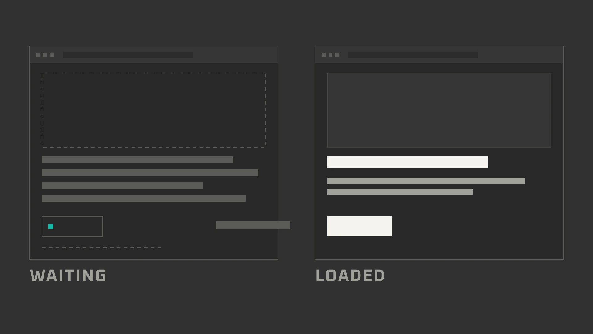
At 9:40 on a Tuesday, a pipe bursts under a kitchen sink. The owner searches, taps the first sensible result, and waits.
Four seconds pass. Then six. The page is still assembling itself. They go back and tap the next plumber.
You never hear about that visit. There is no notification for the customer who almost called. The phone stays quiet and you blame the market.
A website can look respectable and still lose people at the door. It fails three tests: a stranger cannot tell what you do, cannot decide whether to trust you, or cannot work out how to reach you. These are the signs your business website needs improvement, in the order a customer meets them.
1. Your Site Is Slow to Load
Picture a receptionist who takes six seconds to look up. You would still check in, but you would notice. On a phone, six seconds is enough for a visitor to leave.
The usual suspect is not clever code. It is a hero photograph the size of a small album, a stack of tracking scripts, and a font file that holds up the page while it downloads.
Point PageSpeed Insights at your site and read the mobile score. A low score is not proof that customers are leaving. If everyone in town already knows your name, it may only be housekeeping. What the report does give you is a list: the photograph, the scripts, the font. Fix the biggest image first, then put one clear button above the fold.
Try this first. Shrink the homepage photograph to a few hundred kilobytes. On a typical small site, it is often the single biggest improvement.
2. Hard to Use on a Phone
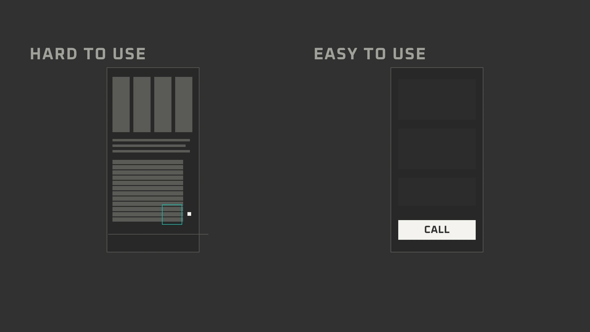
A driver pulls over outside a unit, one hand on the wheel, the other holding a phone. They need your number.
What they get is 11px text, a menu that opens into a wall of links, and a phone number hiding at the bottom of the page. They pinch, squint, give up, and call the garage across town.
The fix is thumb work: larger type, buttons you can hit without aiming, no sideways scrolling, and a menu that closes. The WCAG guidelines treat this as accessibility, not taste.
Open your own site on your phone. Use only your thumb. If you have to think about where to tap, a stranger already has.
3. Nobody Knows What You Do
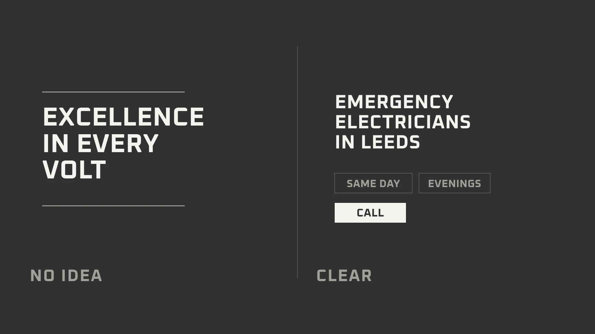
“Excellence in every volt” sounds expensive. It also explains nothing.
A visitor cannot tell whether this electrician rewires houses, fixes industrial panels, or installs car chargers. They cannot tell whether the van comes to their postcode. Nobody rings to ask. They scroll to the next result and call someone who says it plainly.
Your first screen has one job: what you do, where you do it, what happens next. “Emergency electricians in Leeds, same day” is not poetry. It is a door.
4. Your Number Is Hard to Find
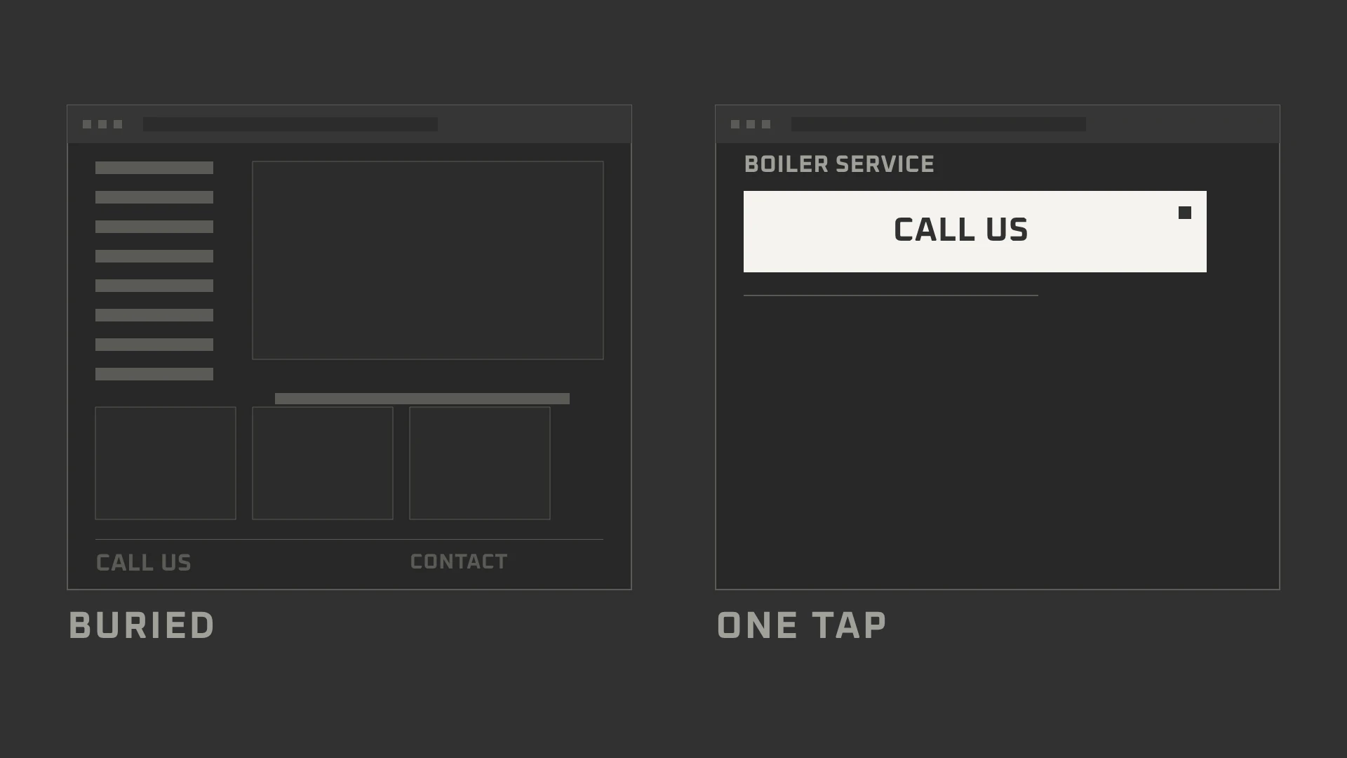
A bride wants to book a salon for Saturday. She finds your page, scrolls past a gallery, opens a menu, and lands on a form with twelve fields and no phone number. She leaves to find someone who answers.
The fix is a single obvious door. Put the phone number at the top of every page and make it tappable. Keep one short form beside it for people who would rather write than call. Ask for four things: name, number, postcode, and what is wrong. Say when you reply.
The business that answers first usually gets the job. A website that makes people hunt does not.
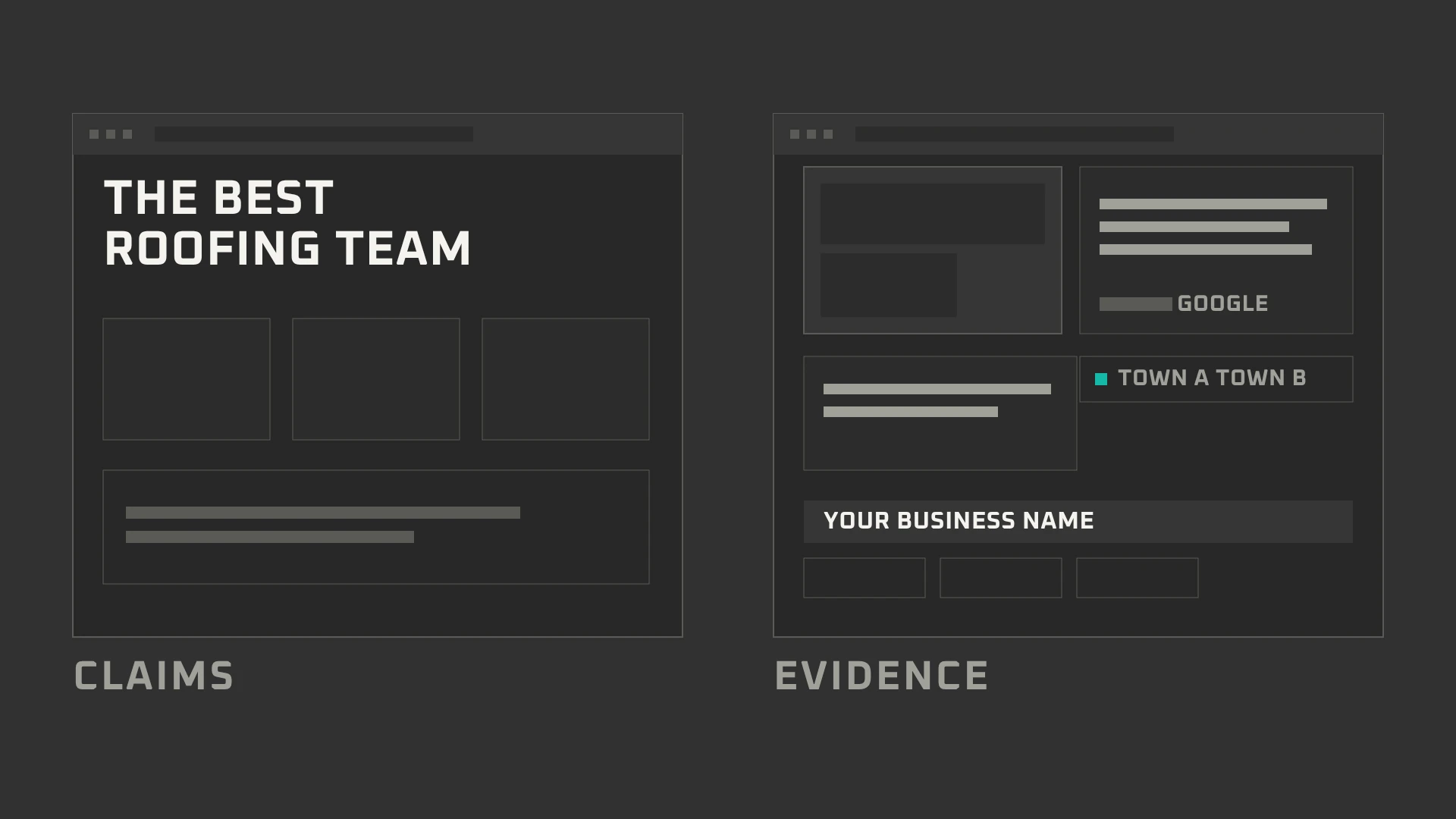
5. No Proof You Are Real
You walk into a workshop. No tools, no certificates, no photographs, just a sign saying “quality work”. You would leave politely.
A website without proof feels the same. Show real reviews with dates. Show photographs of actual jobs, including the messy middle. Give a full business name, a service area, and a person behind it. Never invent a review or buy one. One lie undoes ten truths.
The best website cannot manufacture trust. It can only display the evidence you already have.
6. The Site Looks Abandoned
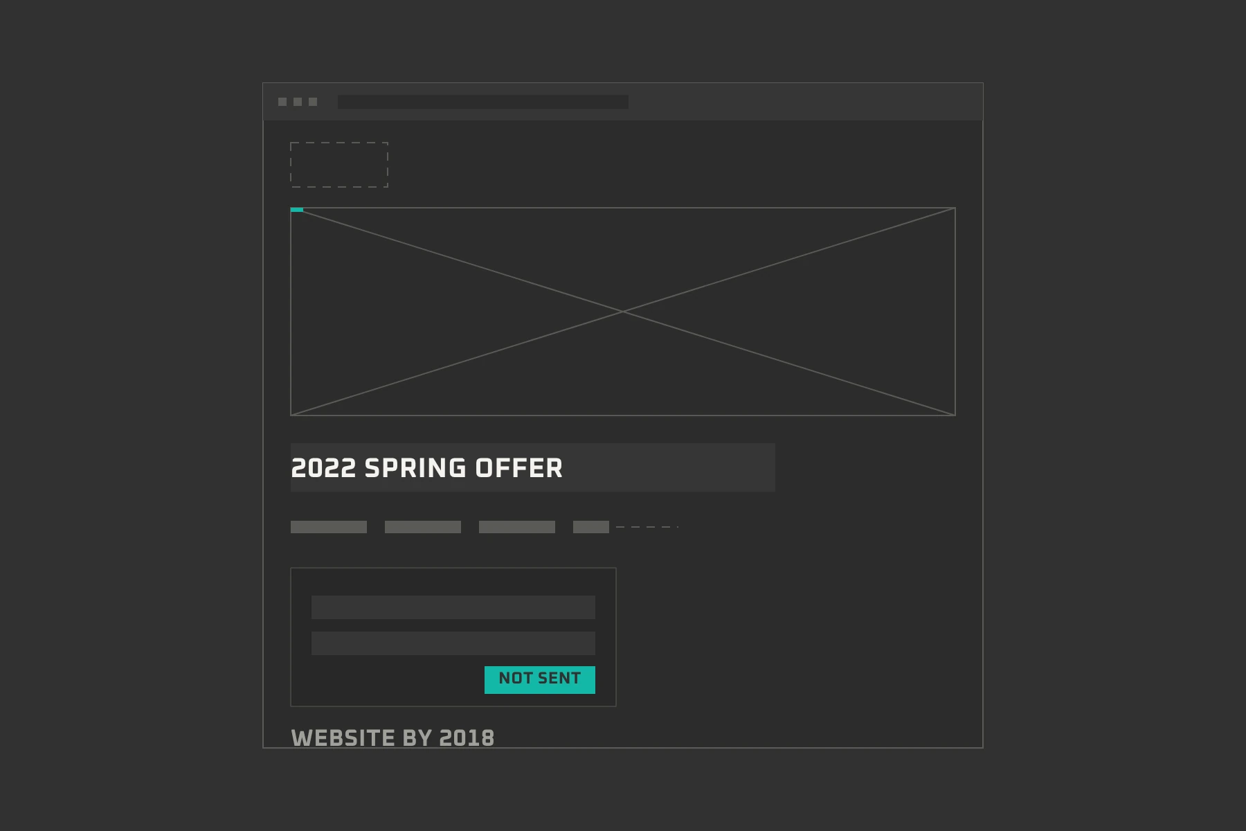
A website from 2012 can still work. An old cardigan is not a dirty collar. What loses customers is a site that stops working.
The offer from 2022 still blinking at the top. The broken image. The link that opens nothing. The copyright year from another decade. The phone number that no longer matches the van.
Visitors do not read those as “old”. They read them as “closed”.
Run a dead link checker once a year. Change the banner when the season changes. Fix one thing each month. Maintenance is cheaper than a rebuild, and far cheaper than the customer who quietly leaves.
7. Simple Jobs Take Too Many Steps
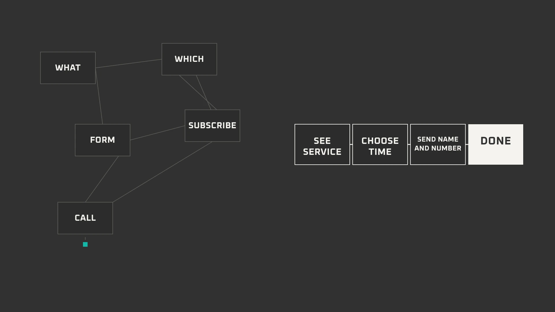
A visitor has one job: call, book, or ask. Every extra step is a chance to remember something better to do.
A menu with 24 links. A newsletter pop-up before the page has loaded. A fifteen-field form. Three buttons all shouting for the same tap. None of it feels like much to you. All of it adds up to “I will do it later”.
Google has warned against pop-ups that cover the page on phones. The advice is simple: be helpful, not in the way.
Count the taps between wanting to contact you and doing it. If it takes more than two, remove one.
The 10-Minute Check
Open your site on your phone and walk through these seven. It takes one coffee.
- It loads.Open the homepage and one service page; if either drags, run PageSpeed Insights.
- The first screen says what you do.What, where, and what to tap next, all within ten seconds.
- The number is one tap away.At the top of every page, not buried in the footer.
- The form asks four things.Name, number, postcode, and one line about the problem.
- Proof is visible.Real reviews with dates, and photographs of actual work.
- Nothing is broken or expired.Old offers, dead links, missing images, wrong opening hours.
- One clear next step.Pick one action and make it the largest thing after the headline.
If you would rather hand over the build, the upkeep, or the visibility work, start with web development, maintenance, or Search & AI Visibility.
You Do Not Need Perfection
You need a stranger to understand you, trust you, and reach you without a fight.
Somewhere this week, a pipe will burst, a driver will pull over, and a bride will look for a salon. Let the page they tap answer them.
Fix those three things, and the quiet phone starts making noise again.
WEBSITE REVIEW
We review small business websites and send back the short list of what actually matters: what to fix now, what can wait, and why. No jargon, no obligation, no sales call. If something on your site is quietly losing you work, we will tell you where it is and what it would take to stop it.