

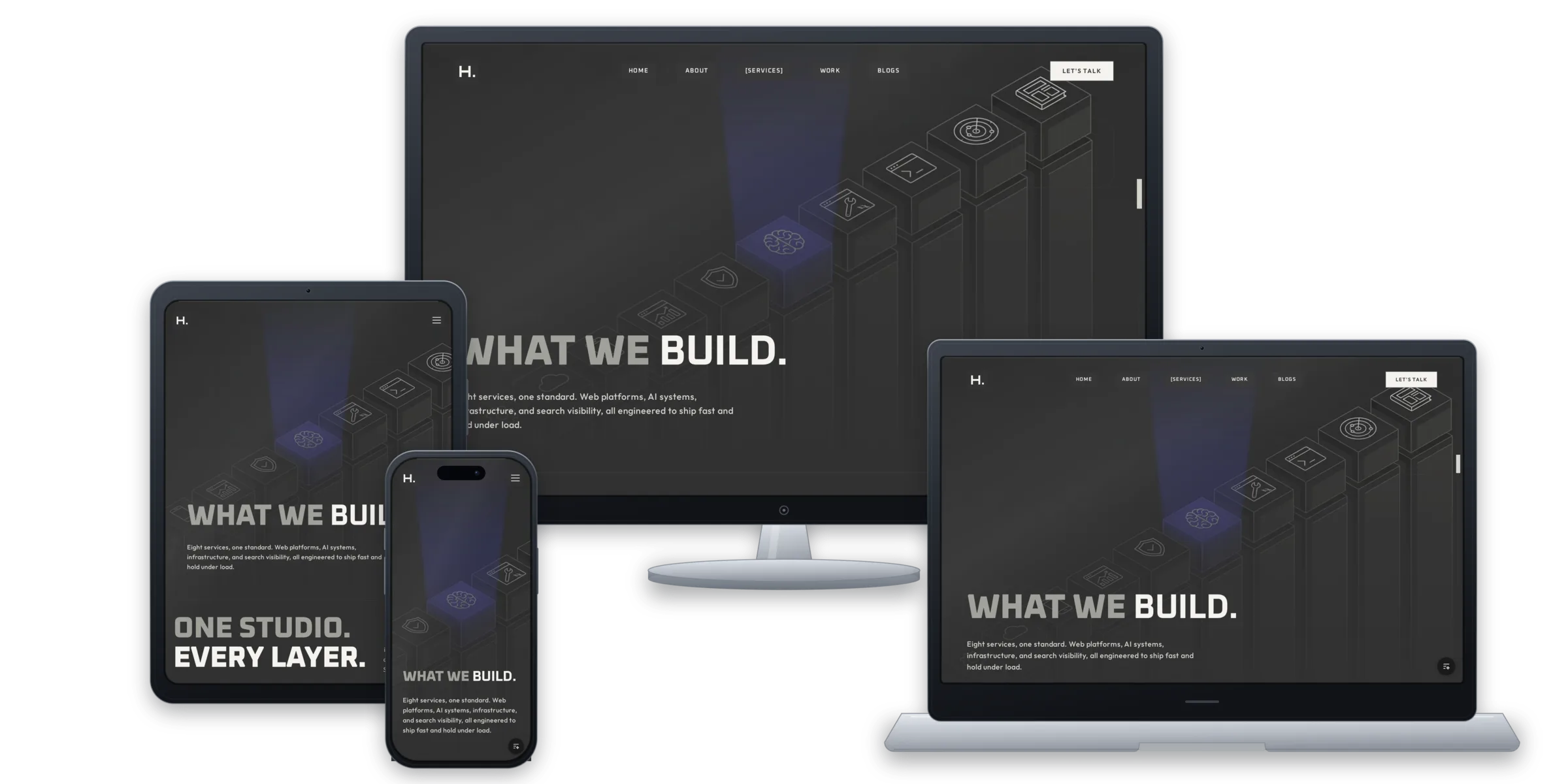
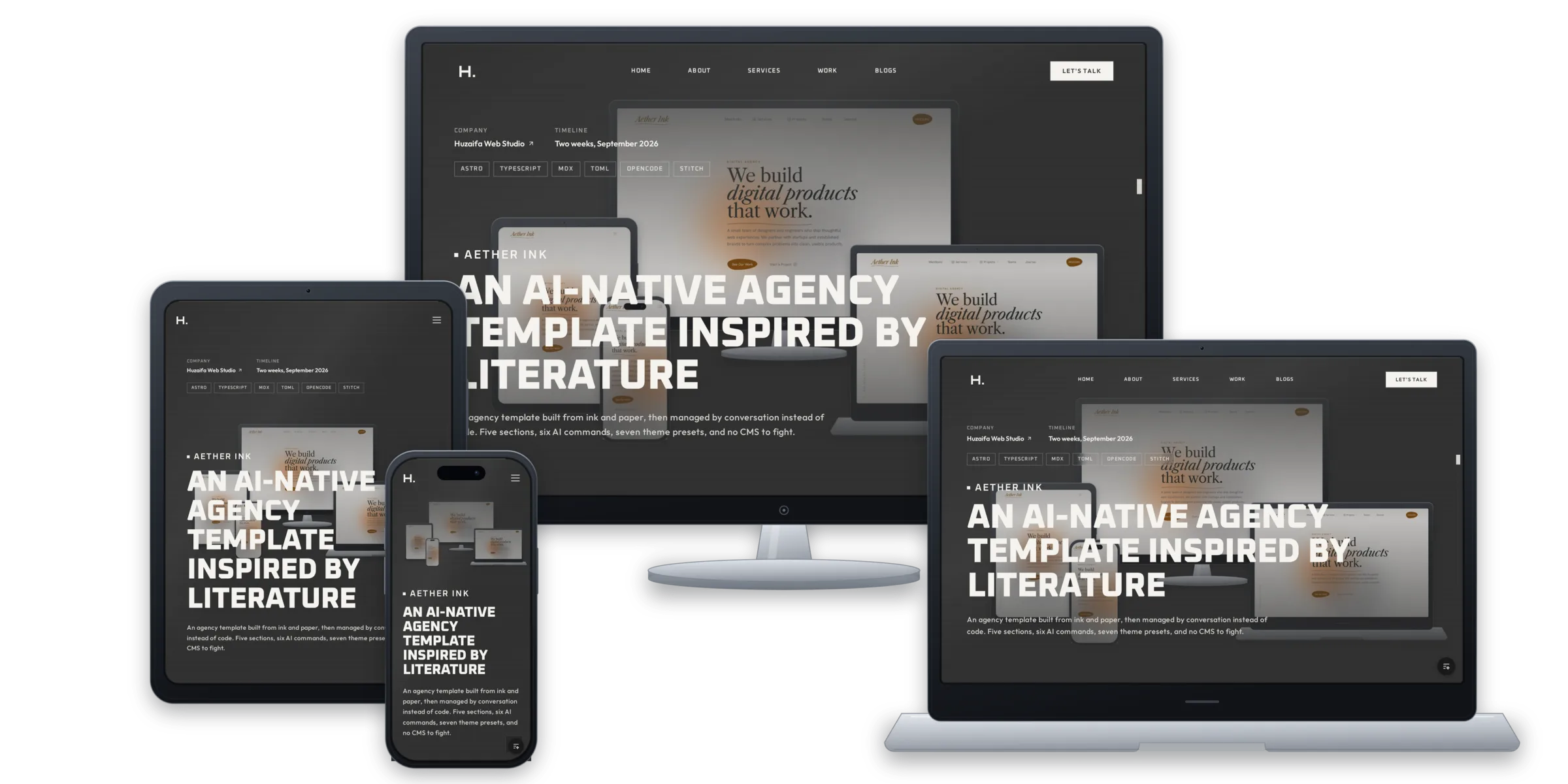
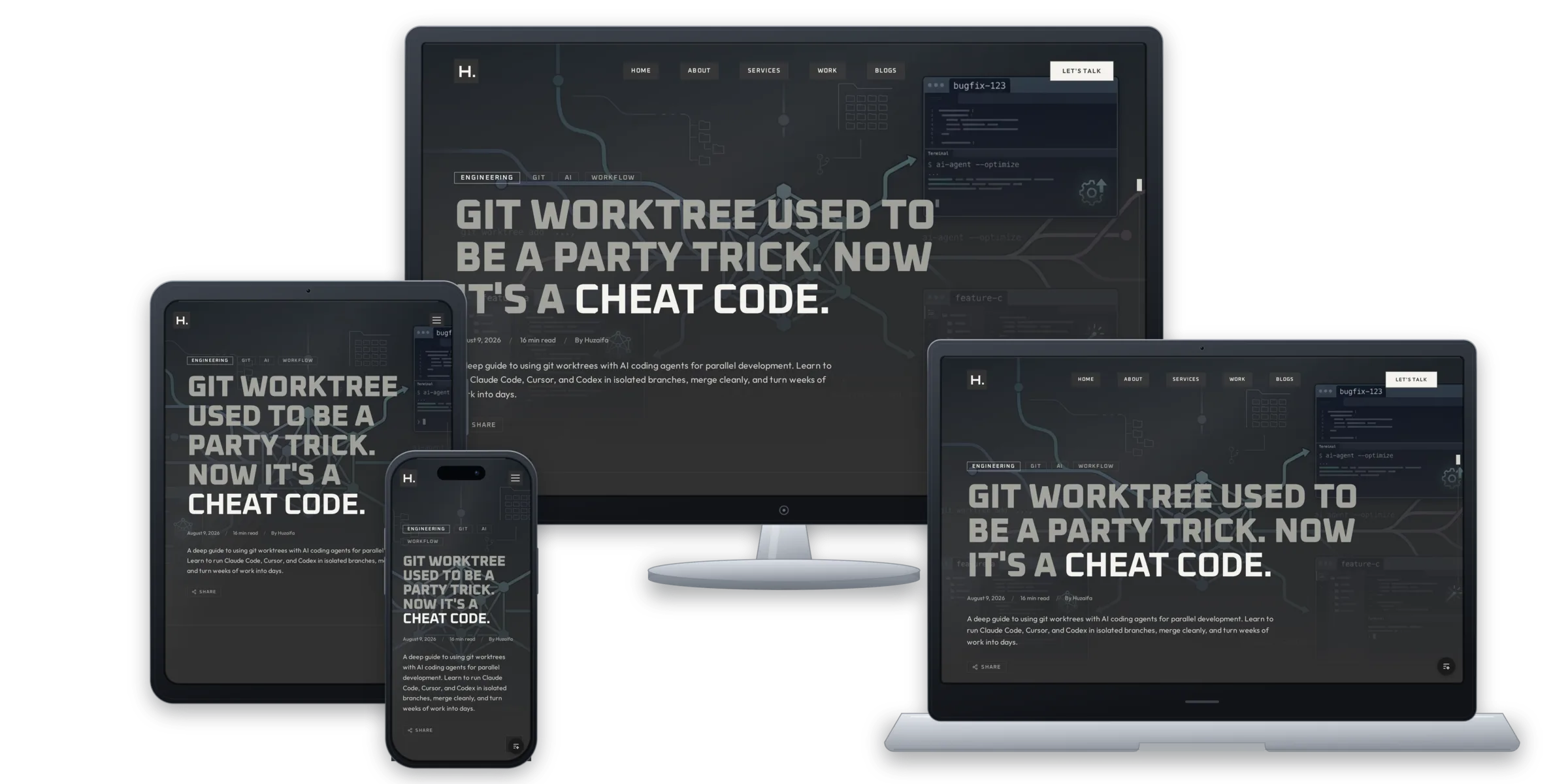
Studio Site
A Studio Site Built as a Content System
The studio's own site, built as proof: one place for every word, one rulebook for design, and pages that stay fast, cheap, and honest as they grow.
Founder & Lead Engineer
An agency site is usually a claim. This one had to be the evidence.
The client was us
The client was the studio. That removed the two things a case study normally leans on: a deadline somebody else set, and a scope somebody else agreed.
Three rules came before the first pixel.
- It had to be found when someone searches for “Huzaifa web”, the name people actually type.
- It had to be readable by AI assistants, not only by people.
- One engineer had to run it with no content management system.
Each rule removed an option. A page builder fails the third. A brochure fails the second. A pile of thin keyword pages fails all three, because there is nothing on them worth quoting.
A fourth job came after those three. The site had to prove the studio’s own claims: fast, premium, and built to scale. A studio cannot write that on a page and leave it untested, so the page had to be the test.
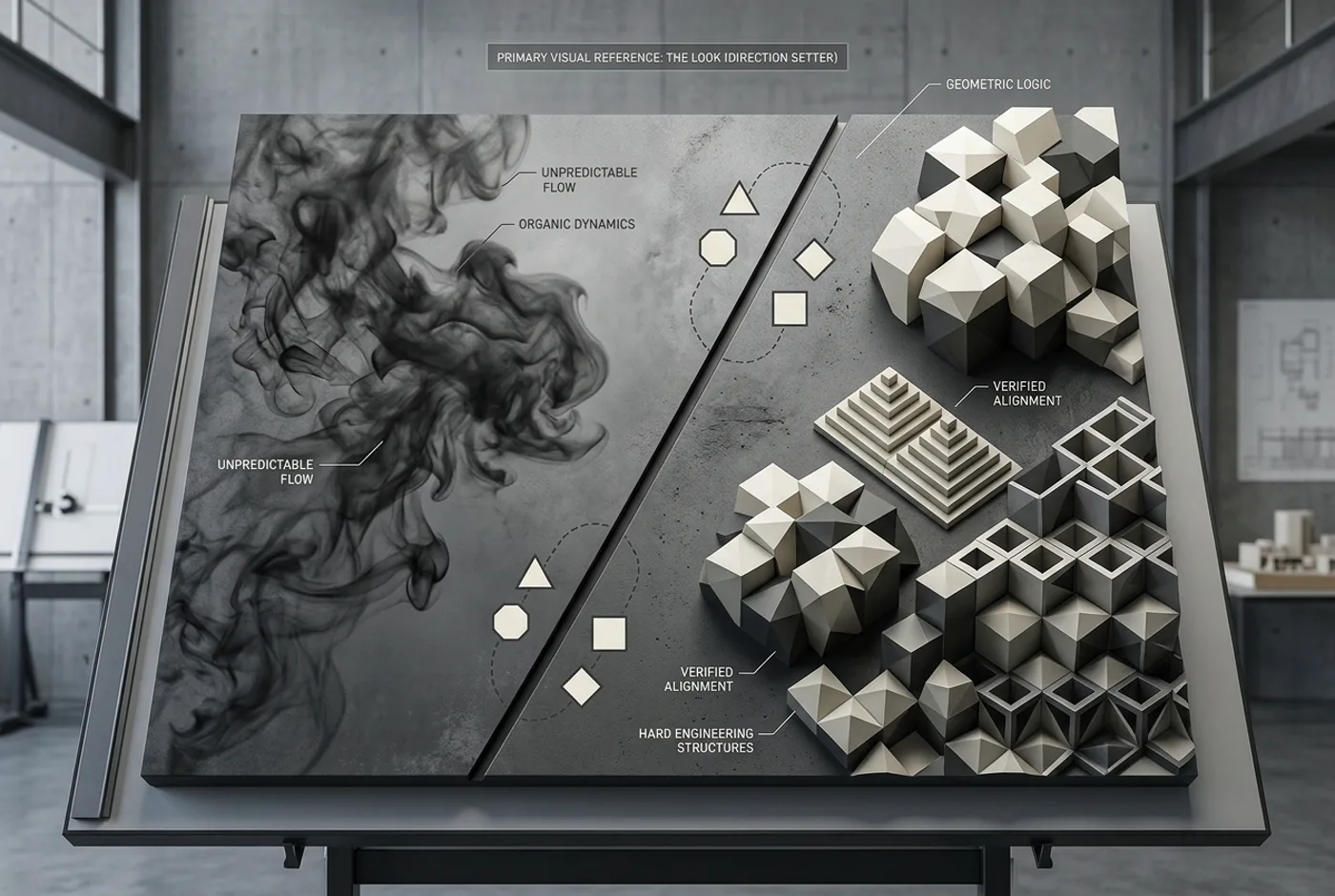
Smoke and geometry
The direction came from two things that should not sit together.
Smoke is soft, slow, and impossible to hold. It moves without an edge, and no two seconds of it are the same shape. Geometry is exact, repeatable, and unforgiving. It has nothing but edges, and every one of them can be measured.
The site puts both in one frame. A diagonal cut crosses a smooth charcoal plane at a fixed angle, and hard 1px lines, square corners, and tracked labels hold that cut in place. The smoke gives the page its movement. The geometry gives it a ruler.
That is why the corners are square and the diagonal never changes. A rounded corner or a freehand angle would break the agreement between the two, and the page would read as decoration instead of as a system.
Elegance is the restraint that follows. One accent colour per service. Two typefaces, each with a fixed job. Depth from layers of tone rather than shadow. Nothing on the page is there to fill space.
One rulebook instead of a hundred decisions
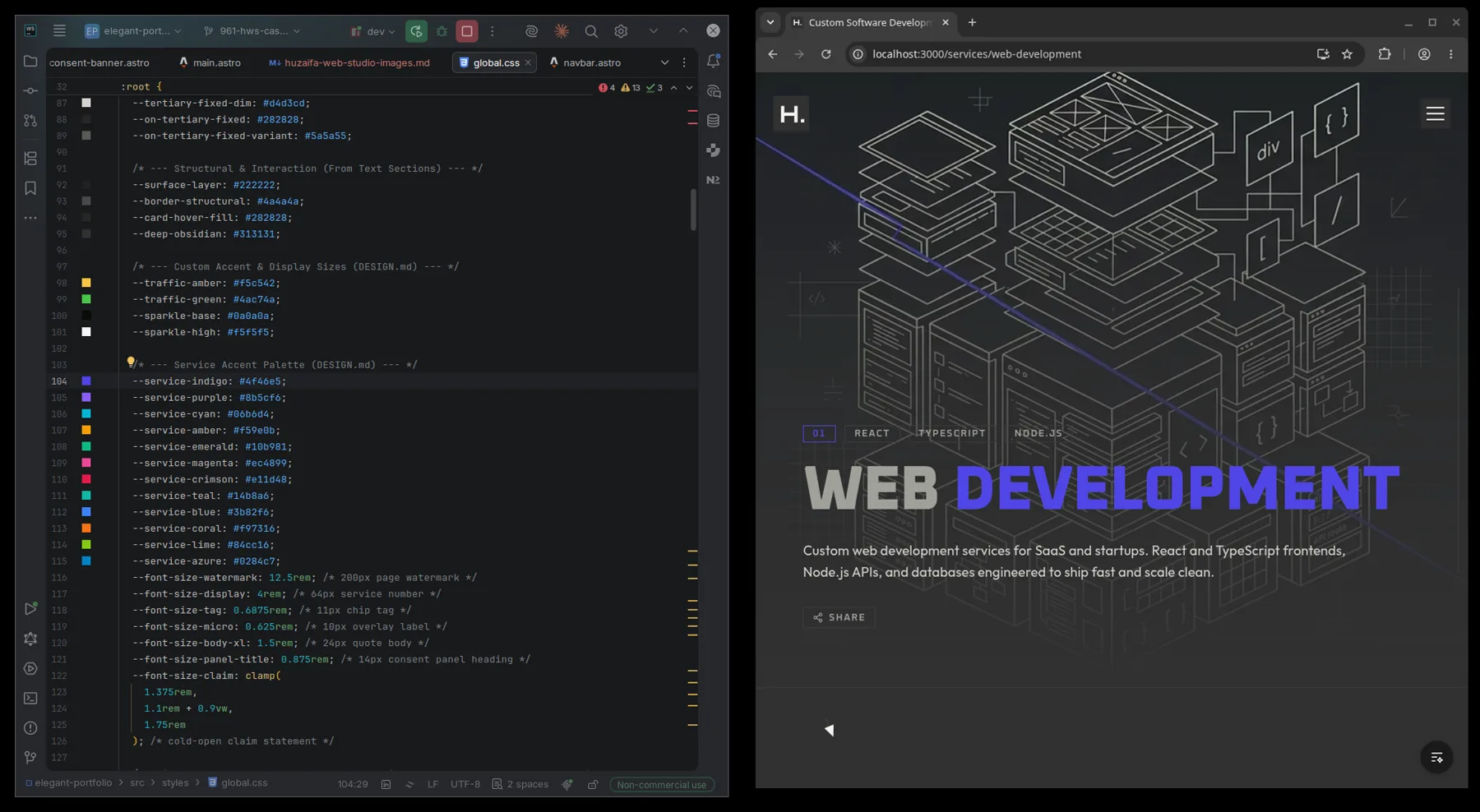
Every colour, size, and font comes from a single file. Pages point at names in that file, never at values.
A colour code typed straight into a page is a mistake, not a style choice. It means that shade exists in one place, and nowhere else, and the next person cannot find it.
| Rule | What it prevents |
|---|---|
| One list of colours and sizes | A shade that exists on one page and nowhere else |
| Square corners everywhere | A design that drifts as pages are added |
| One typeface for structure, one for reading | Headlines that try to do the job of body copy |
| Twelve accent colours, eight in use | A new colour invented when a service returns |
| Words stored outside the design | A sentence trapped inside a layout |
The accent system is the clearest example. Twelve accent colours exist and eight services use them. The four spare ones are not dead weight. They are what lets a paused service come back without a new design decision, and each card reads its colour from the service’s own entry, so no colour code ever reaches a layout.
Type does the same work. Oxanium carries structure: headings, labels, numbers. Outfit carries reading. The two never swap jobs, which is why the largest headline and a paragraph of body copy still read as the same site.
Square corners are the cheapest rule to keep and the easiest to break. One rounded corner would read as a different product.
The words live in one place
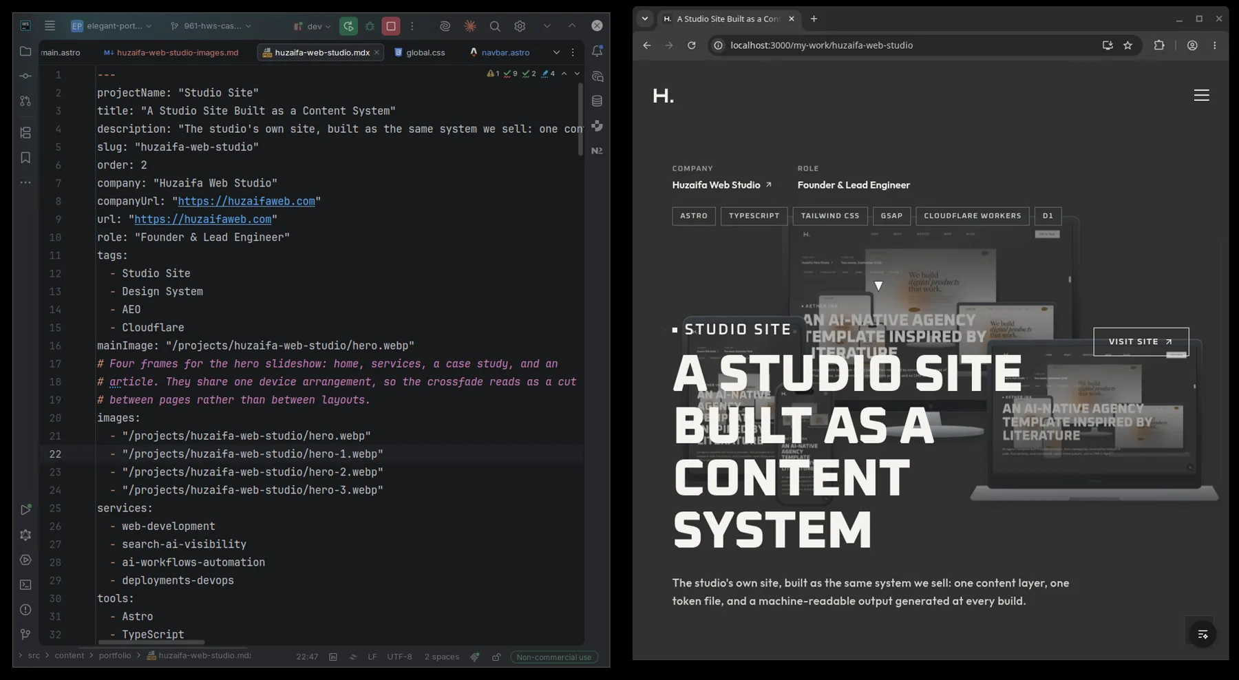
Twenty kinds of content, and every one of them is a form.
A page, a service, a case study, an article, a milestone, an answer to a question: each is an entry with required fields around it. A case study cannot be published without a title, a client, and a picture, because the form will not let it.
That is also why a page never shows an empty gap where a paragraph should be. A missing field stops the site from publishing instead of shipping a hole.
And a layout can never hold a sentence. A layout can hold a shape. It cannot hold copy. Every word lives with the rest of the words, where someone can find it and change it.
Hiding something is one switch. Turning a service off removes it from seven places at once: the home grid, the services index, its own page, both contact forms, and two sets of machine-readable labels. Hiding a page used to mean seven edits and one forgotten reference.
Written for two readers
Half the audience for a page like this is not a person. It is a search result, a snippet, or an assistant answering a question on the studio’s behalf.
The first layer is conventional: clean page addresses, a description for each page, and hidden labels that tell search engines what kind of business this is, where it is, and what it offers. The search targets behind the pages were checked against real search data in October 2026, so they are measured rather than guessed.
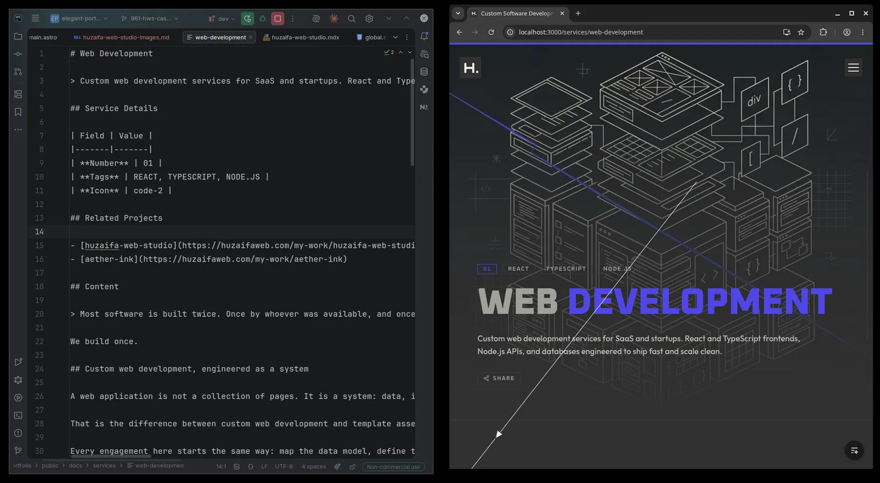
The second layer is less common. Every time the site is published it writes three machine-readable files: a map of the site, the full text of the site, and one plain summary per page. An assistant that wants to describe a service reads the same words the page was built from.
That layer went wrong once, and the failure is worth keeping. The first version was written by hand. It advertised twelve services while the site showed eight, because a person typed the summary and the content moved on. Two files disagreed with each other, and an assistant reads the file.
The fix was not a correction. It was a rule. Every summary is now generated from the content, and a check fails when the two drift apart. The next mistake is caught by a command, not by memory.
The form that cannot lose a lead
The contact form is the one place where a bug costs money, so it runs in a fixed order.
| Order | What it protects |
|---|---|
| The visitor is checked as human | Bots never spend the email allowance |
| The message is cleaned | Oversized or broken input never reaches the database |
| The message is saved | A failed email cannot lose the enquiry |
| The delivery result is recorded | A silent failure cannot look like a success |
The database is the record. Email is a notification on top of it. That ordering is why the form still says thank you when the email fails: the enquiry is already saved, and an error would only make the visitor send it twice.
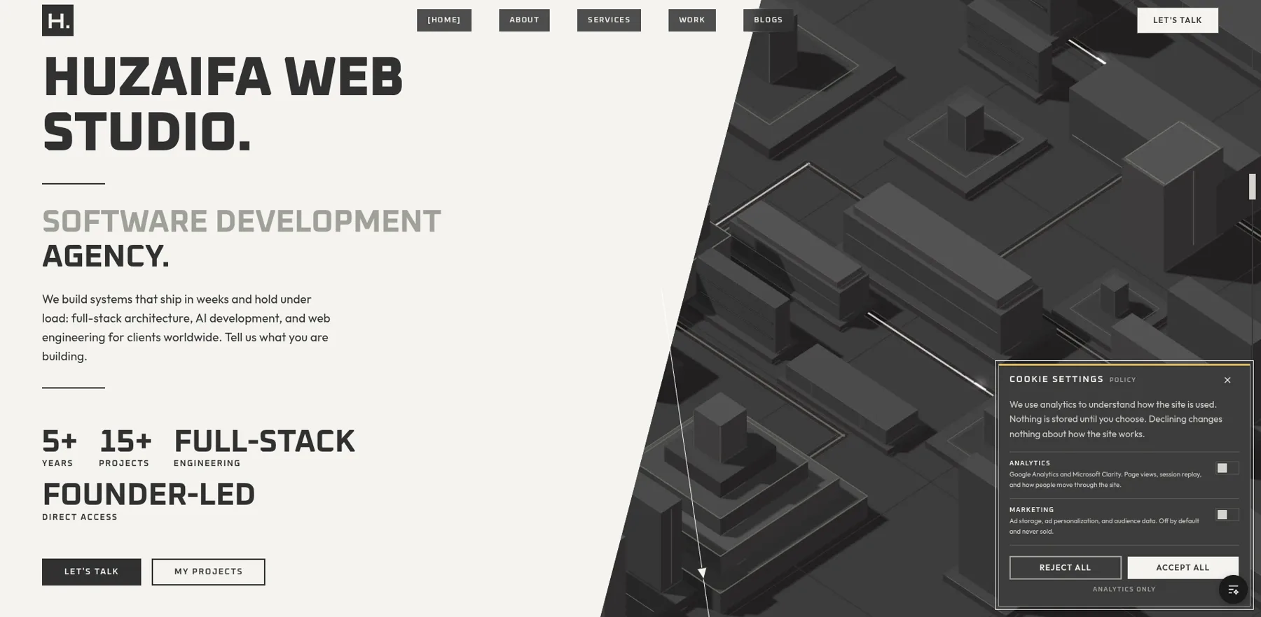
Consent follows the same shape. Two analytics tools, one choice. Everything starts switched off, and the panel applies the decision to each tool separately, because granting one and not the other is the normal case rather than the edge case.
Fast because of how it is built
The site runs on Cloudflare’s network. One system serves the pages, answers the contact form, and handles everything around them: redirects, the instructions for search engines, security headers, and the markdown summaries.
There is no server to start and no container to keep warm. A page is a file that was built once and delivered from the nearest city. Nothing has to wake up before the page arrives.
The contact form is the only part that remembers anything, and it uses a database that sits beside the site. A message is saved before any email is sent, which is the ordering described above. It is a real record with delivery status, not a form that forwards to an inbox and forgets.
| Piece | Job | Cost at this traffic |
|---|---|---|
| Cloudflare Workers | Pages, contact form, redirects, headers | Free plan |
| Cloudflare D1 | Every enquiry, with delivery status | Free plan |
| Static files | Pages, fonts, images, video | Included |
Hosting this site costs nothing per month. The free plan covers 100,000 requests a day, far beyond what a studio site uses, and the database allowance covers the form at this volume. If traffic ever outgrows it, the paid plan starts at $5 a month, so the ceiling is a known number rather than a surprise on a bill.
That is also the speed argument, and it is structural rather than tuned. The page a visitor gets is the file that was built, delivered from the closest edge. No rendering, no trip to an origin server, no queue behind another visitor. The heaviest things on the page were made small for it: the home video is 258 KB and the About video is 167 KB, so together they weigh less than half a megabyte. The posters are under 70 KB, and every screenshot is compressed for the web.
A visitor who prefers reduced motion gets the poster and never a frame of movement.
How it was built
Content model
The kinds of content came first. Each got its form before it got a layout, so the shape was decided while it was still cheap to change.
Design rules
One stylesheet for colour, type, spacing, and the service accents, with square corners enforced in the rules rather than left to memory.
Pages
Assembled from the content, so a new entry is a file and never a change to a layout.
The machine layer
The AI-readable files and the per-page summaries, written at publish time from the same content the pages show.
Runtime
Cloudflare for the contact form, redirects, security headers, and the generated summaries, with the database behind the form.
What shipped
Twenty kinds of content.
Every page type is a form, checked when the site publishes, so a missing detail fails the site instead of the page.
One rulebook.
Colour, type, spacing, and twelve service accents, with no colour code inside a layout.
Eight services from one list.
Pausing one removes it from seven places without an edit anywhere else.
Three files for machines.
A site map, the full text, and a plain summary per page, all made from the content.
No content management system.
Publishing means adding a file that the site already understands.
The site runs on the studio’s own domain and is maintained by the engineer who built it. That is the honest version of the claims: nothing here is a demo, and every page on it has to survive the same review a client’s page would.
We could not ask a client to trust a system we had not run ourselves.
THE STUDIO SITE
Want the same system on your own domain, shaped around your content and your buyers? Tell us what you are building.