UI/UX Design
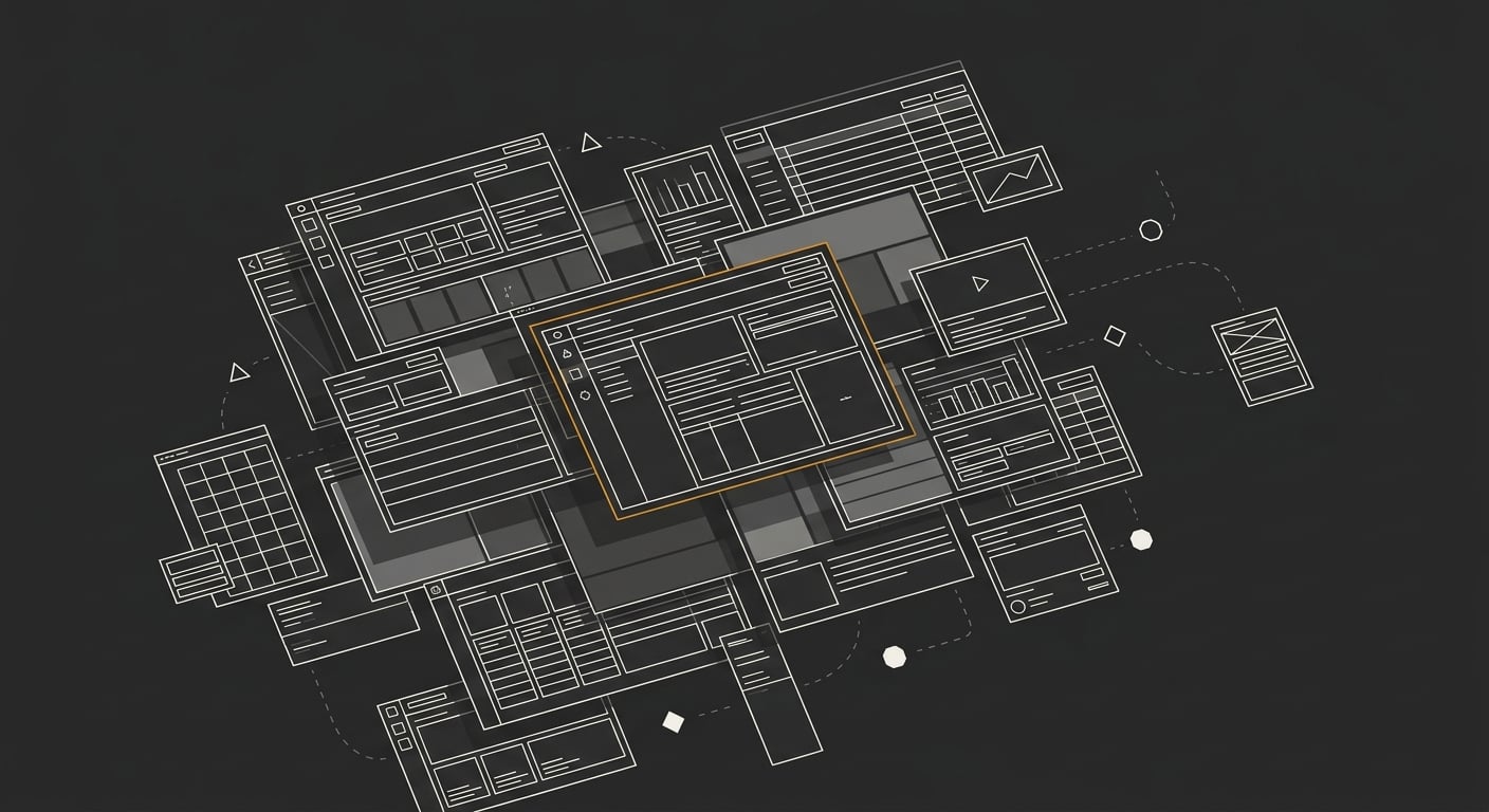
UI/UX design services for web and mobile. Design systems, wireframes, and high-fidelity prototypes engineered for clarity, accessibility, and conversion.
When that interface is clear, users never think about it. When it is fuzzy, they churn, they call support, they leave. UI/UX design is the discipline of removing every moment of confusion between those two points.
Interfaces engineered, not decorated
Most design fails at the seams: the empty state nobody drew, the error message nobody wrote, the loading state that flashes white. Screens are easy. States are the product.
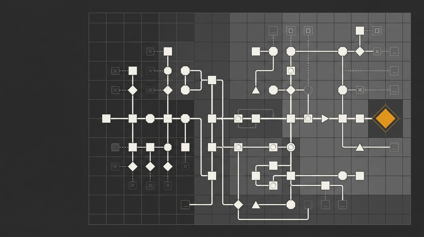
The work here starts with flows, not frames. Where does the user come from? What are they trying to do? What happens when it fails? Only then does visual design begin, on a foundation that already accounts for reality.
What you get
User flows and information architecture. The structure decided before any screen exists.
Wireframes. Low-fidelity layouts that validate flow and hierarchy while changes are still cheap.
High-fidelity UI. Pixel-exact screens with every state designed: default, hover, focus, loading, empty, error.
Interactive prototype. A clickable Figma prototype that lets stakeholders feel the product before a line of code exists.
Design system. Tokens, components, and documentation that keep product version ten consistent with version one.
Accessibility built in. WCAG-conscious contrast, focus order, and semantics from the first draft.
How the engagement runs
Understand.
Structure.
Design.
Systemize and hand off.
What a design system changes
| Screen-by-screen design | System-driven design | |
|---|---|---|
| New feature | Designed from scratch | Assembled from components |
| Consistency | Drifts every sprint | Enforced by tokens |
| Developer questions | Endless | Answered by documentation |
| Redesign | Ground-up rebuild | Token swap |
| Cost over time | Compounds | Flat |
Good design is invisible. Users just get where they were going and wonder why every other app feels harder.
Who this is for
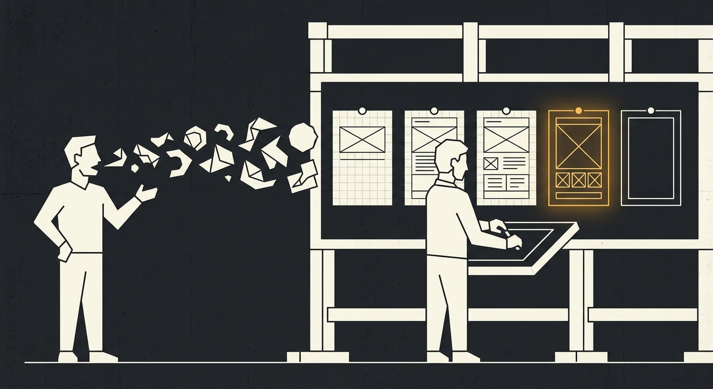
SaaS teams whose product grew faster than its design. Startups that need investor-ready interfaces before writing backend code. Founders who can describe exactly what they want but cannot draw it. Teams with developers but no designer, drowning in inconsistent UI.
Start designing
OPENING DECEMBER 2026
Bring the product, the problem, or the mess. The first conversation maps what exists, what is broken, and the shortest path to an interface your users never have to think about.
Questions,
answered.
[ FAQ ]
Direct answers for founders and teams evaluating Huzaifa Web Studio as their technical partner.
User flows, wireframes, high-fidelity screens, an interactive prototype, and a component-based design system in Figma. Developer handoff includes tokens, spacing specs, and states for every interactive element.
Yes. All design work lives in Figma with shared libraries, auto-layout components, and variables, so the system scales as your product grows and developers can inspect everything directly.
Yes. Existing logos, colors, and voice become the foundation of the design token set. The system extends your brand instead of replacing it.
Yes. Deliverables are structured for clean handoff: named layers, documented tokens, edge-case states, and a walkthrough session. If you want, implementation can be handled here too, which removes translation loss entirely.
Contrast ratios, focus states, keyboard navigation, touch target sizes, and screen reader semantics are designed in from the first wireframe, not audited after launch.